
Three Effective Diagrams
UML? C4? There's no perfect system for modeling software, so build your own toolkit starting with these three practical & effective diagram types.

As engineers, we spend a lot of time thinking about how to structure code, design systems, and solve complex problems. But we often overlook a crucial skill that helps communicate those solutions effectively through diagrams. Good diagrams can accelerate team understanding, prevent costly misalignments, and bridge the gap between technical and business stakeholders. Let me walk you through what I've learned about making diagrams that actually help people understand your work.
Understanding the Current Landscape
It is a bit vexing that there isn’t really a single standard for software diagrams, but instead a mixture.
UML and Its Lessons
UML dominated software modeling for good reasons. It provided detailed, rigorous notation for object-oriented systems, with specific symbols for every conceivable relationship and interaction. If you needed to model complex inheritance hierarchies or detailed system interactions, UML had the precision to capture exactly what you meant.
However, UML's comprehensiveness became its weakness in many practical contexts. The learning curve was steep for both creators and readers. Business stakeholders often found UML diagrams intimidating, while developers sometimes spent more time debating notation than discussing design. The very precision that made UML powerful also made it unwieldy for everyday communication.
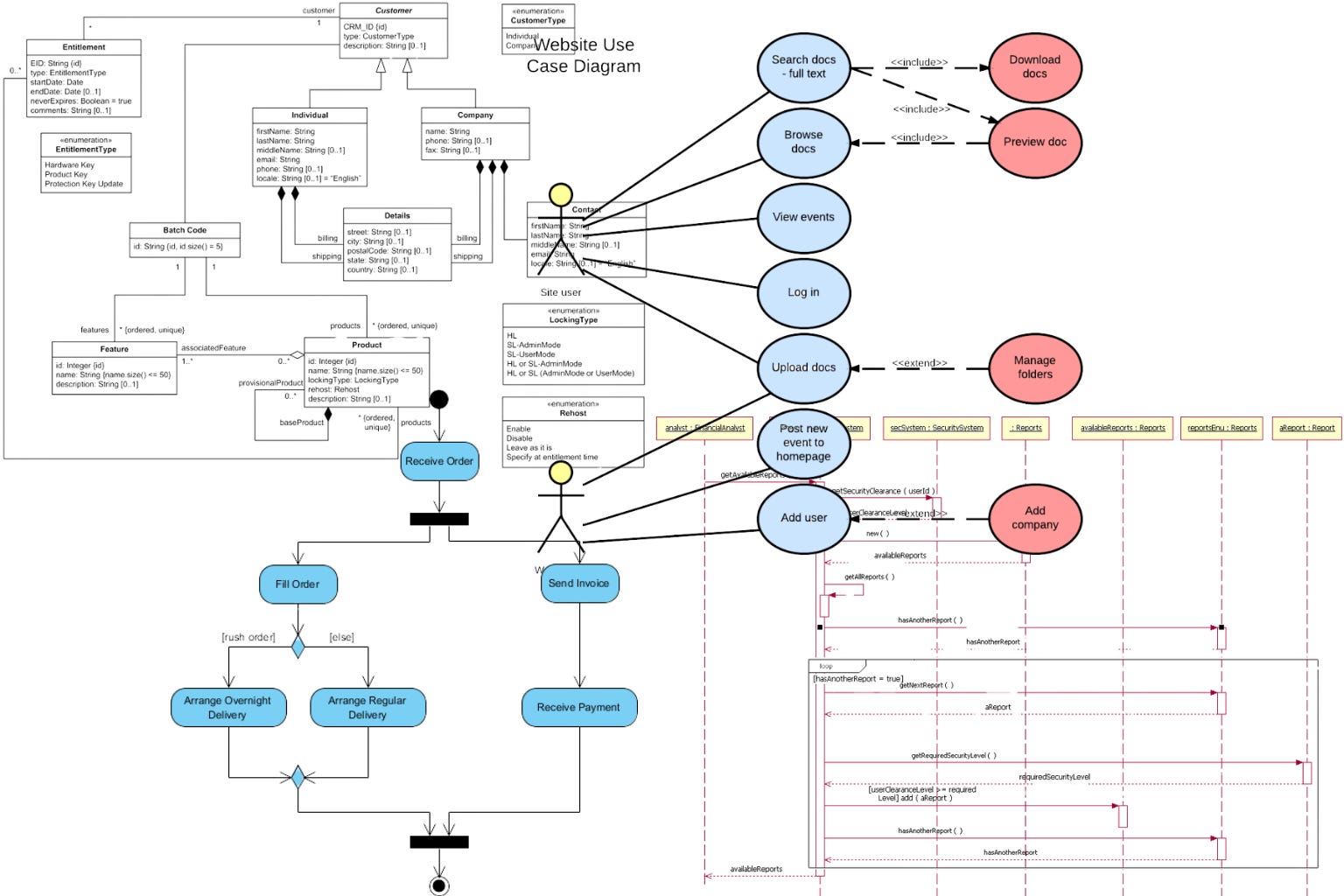
The key insight here isn't that UML was bad. Rather, precision and complexity have costs. Sometimes those costs are worth it, but often simpler approaches communicate more effectively.
C4 Model
Simon Brown's C4 model addresses many of UML's communication issues by starting with a fundamental question about who is your audience, and what do they need to understand?
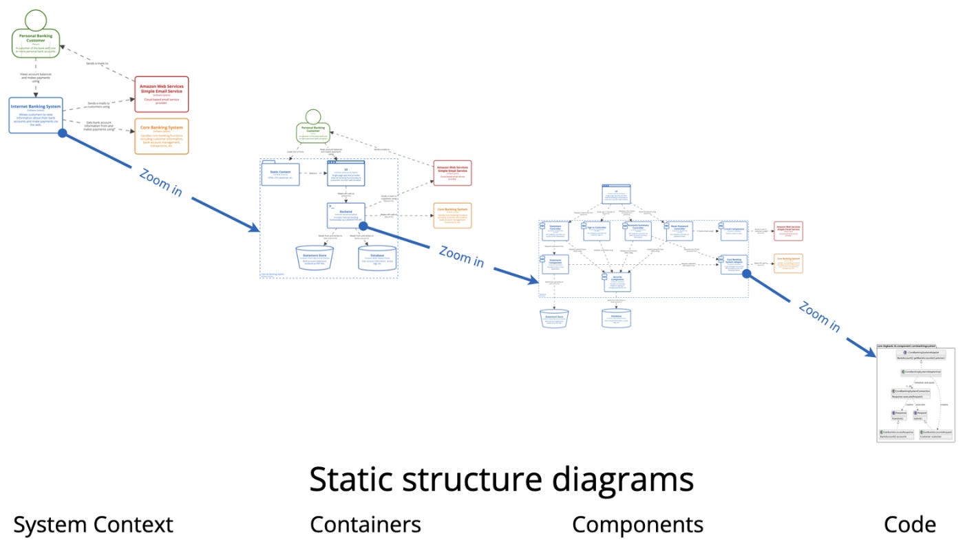
C4's layered approach works well by providing different levels:
Level 1 (Context) works perfectly for executives and product managers who need the big picture. It is in some ways similar to a Use Case diagram from UML.
Level 2 (Container) is great for architects and senior developers planning system interactions
Level 3 (Component) helps development teams working on specific services
Level 4 (Code) is where C4 kind of breaks down, offering little guidance on what the “Code” level should really document
Here is a quote the C4 Model documentation on Code level diagrams:
Finally, you can zoom in to a component to show how it is implemented as code; using UML class diagrams, entity relationship diagrams or similar.
In other words, "use whatever makes sense for your code." This isn't necessarily a wrong answer, but it leaves architects without structure exactly when they need it most when explaining complex technical interactions. After being compellingly prescriptive at the higher levels, C4 just stops before hitting the code level.
The Polyglot Approach
In the absence of one format to rule everything, we have to pick and choose what we need ourselves. There's no single diagram type that works for every situation. Just as we choose different programming languages and architectural patterns based on context, we need to choose diagramming approaches based on our specific communication goals.
This means developing fluency with multiple diagramming styles and knowing when to apply each one. The skill lies in matching the diagram type to your audience, your message, and the level of detail required. Sometimes a quick whiteboard sketch communicates better than a formal diagram. Other times, you need the precision of structured notation.
The benefit of this polyglot approach is flexibility. You can adapt your communication style to meet your audience where they are, whether that's a high-level executive overview or a detailed technical implementation discussion.
The Pedagogical Triangle for Diagrams
Before creating any diagram, it helps to consider three key elements borrowed from education theory:
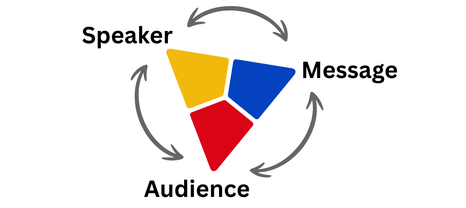
Audience refers to who you are trying to help understand something. Consider their technical background, their role in the project, and what they need to accomplish with this information. A senior developer reviewing your microservices design has different needs than a product manager trying to understand system capabilities.
Author (You) means what's your goal with this diagram? Are you documenting existing systems, proposing new designs, or explaining complex interactions? Your intent shapes how you present information and what you choose to emphasize or omit.
Message covers what specifically needs to be communicated. Process flows, structural relationships, data transformations, or temporal sequences? The content determines which diagramming approach will be most effective.
Effective diagrams balance these three elements. They respect the audience's context and needs, clearly express the author's intent, and convey the essential message without unnecessary complexity.
I also talked about the Pedagogical Triangle for technical writing in Effective Communication Is Teaching.
Three Practical Choices
After working with various diagramming approaches, I've found three types that handle most communication scenarios effectively. They're not perfect for every situation, but they're practical, widely understood, and flexible enough to adapt to different contexts.
Flow Charts
Flowcharts excel at showing what happens and in what order. They're intuitive because most people understand the basic symbols without training. This makes them excellent for:
Explaining overall system processes to mixed audiences
Onboarding new team members
Communicating with business stakeholders
Documenting decision logic and alternative paths
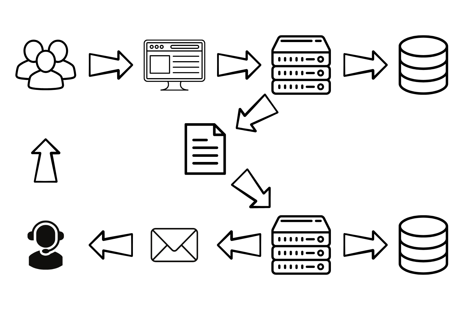
The limitation is that flowcharts don't handle complex technical details well. You can't easily show concurrent processes, detailed error handling, or intricate data relationships. But this limitation is often an advantage because flowcharts force you to focus on the essential flow and hide implementation complexity that might distract from your main message.
Use flowcharts when you need to explain "what happens" rather than "how it's implemented."
Activity/BPMN Diagrams
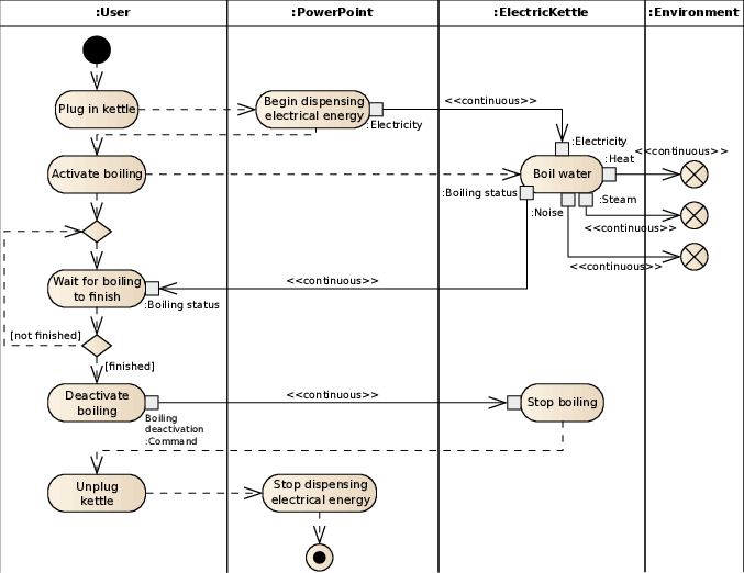
Business Process Model and Notation (BPMN) evolved from UML Activity diagrams but learned from UML's practical limitations. BPMN provides more precision than flowcharts while remaining more accessible than full UML.
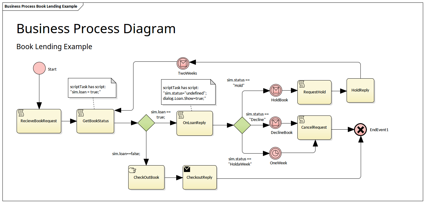
Activity diagrams particularly shine when modeling:
Asynchronous operations and message passing
Error handling and exception flows
Cross-team or cross-system processes
Parallel processing and synchronization points
The notation has enough semantic richness to capture complex workflows while remaining readable for both technical and business audiences. The learning curve is steeper than flowcharts, but the investment pays off when dealing with sophisticated process flows.
Use an Activity or BPMN diagram when you need to explain “how, exactly, does this work?”
Entity-Relationship Diagrams
The key to effective ER diagrams is keeping them conceptual rather than technical. Instead of focusing on database schemas, use logical ER diagrams to show:
Business concepts and their relationships
Data flow between system components
Business rules and constraints
High-level system architecture
Logical ER diagrams work at multiple levels of abstraction. They can show high-level business relationships for stakeholder discussions or more detailed logical relationships for design conversations. The important thing is to resist the temptation to dive into implementation details like data types or physical storage because that shifts the diagram's purpose from communication to documentation.
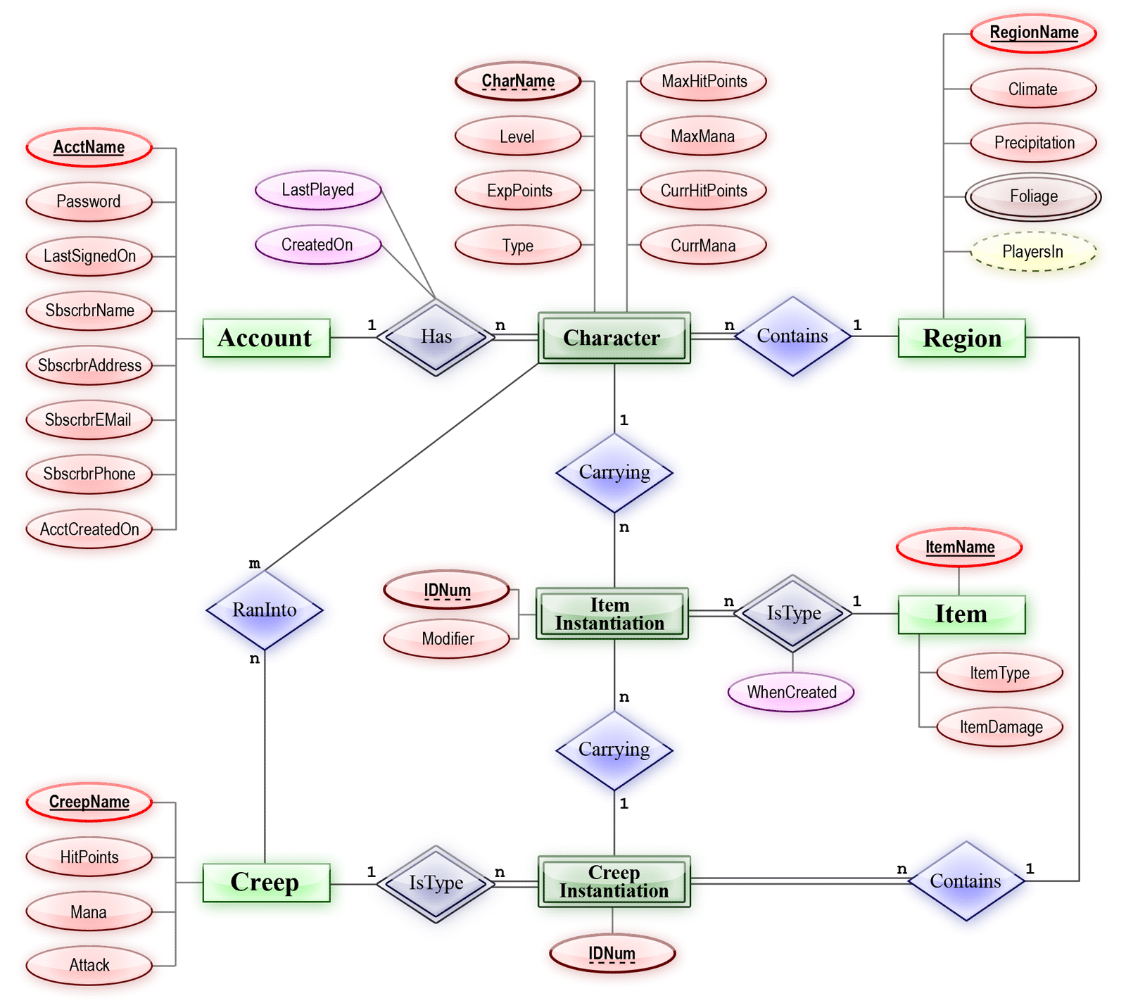
Don’t make the mistake of starting to assign value types and trying to think of relationships as joins or Foreign Keys. That is all database talk, and logical ERDs are not database diagrams. You might manifest one into a physical ERD that describes your database, but if you let your database define your models, you will inevitably make made choices for your system in an effort to make things work more easily in your database.
Use Entity-Relationship diagrams any time you need to clarify “what things are we talking about,” or “how do these things related to one another?”
Visual Design Principles
Content is crucial, but visual design significantly impacts how well your diagrams communicate. A few key principles make a substantial difference:
Simplicity means including only elements that serve your message. Every box, arrow, and label should have a purpose. Extra detail doesn't make you look thorough but rather makes your main points harder to find.
Consistency involves using the same symbols, colors, and styling conventions across related diagrams. This helps your audience focus on learning your content rather than decoding your notation. Consistent visual language builds trust and reduces cognitive load.
Meaningful emphasis uses visual weight (size, color, position) to highlight what's important. If critical elements look the same as minor details, your priorities aren't clear to your audience.
Building Your Personal Toolkit
Effective diagramming is a skill that develops through practice and reflection. Start by choosing a small set of diagram types that fit your common communication scenarios. Master these thoroughly rather than trying to become expert in every possible notation. Don’t even sweat learning the exact styles of the formats you’re adopting if they don’t communicate useful information in your domain or confuse your team - develop your own notations as long as they are clear and consistent.
As you use diagrams regularly, you'll develop your own conventions and shortcuts. Your team and stakeholders will learn to read your visual style, just as they learn to read your code or writing style. This creates a form of professional communication that goes beyond just transferring information and builds shared understanding.
The specific techniques and tools will continue evolving, but the fundamental principles remain constant. Understand your audience, clarify your message, and choose appropriate tools for your communication goals.
Remember that diagrams are tools for thinking and communicating, not just documentation. The process of creating them often clarifies your own understanding, and the conversations they generate are frequently more valuable than the diagrams themselves. Use them as starting points for discussion, not final statements of truth.
The goal isn't to become a diagramming expert but rather to become more effective at helping others understand complex technical concepts. Good diagrams are simply a means to that end.