Throughline: Finding the Leading Indicator Inside Your Lagging Metric
I built a small tool that maps your metrics and solves backward from the goal to the levers.

A leadership team sets a goal: grow revenue 20% this year. Everyone nods - after all, you don’t contradict the boss right? Then you go back to your desk and stare at your backlog and think, “Do these actually grow revenue? Do they grow it 20%?” You focus in on what you feel is the real pain-point, an OKR that has been languishing: user-retention. Its obvious that it affects revenue, but your leadership wants to see new features with projected revenue - the connection between retention and the 20% lift they want is not a straight and obvious one to them.
How do you make the connections of leading and lagging indicators and metrics clear to all parties so that you can focus investment where it matters? You have to be able to model all the assumptions you have about metrics and their relationships and then explore how they interact.
I built a small tool to work on this problem directly. It’s called Throughline.
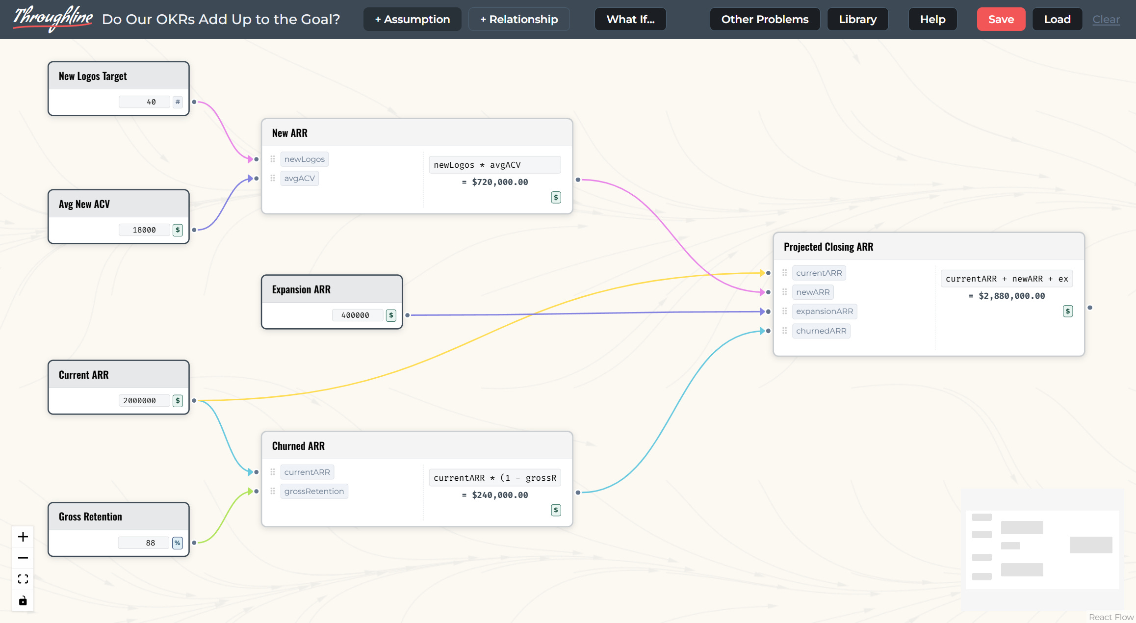
Build the model to think it through
The idea is simple: map how your metrics actually connect, then trace backward from the outcome you care about to the assumptions that drive it. Once the causal chain is visible, you can find which upstream lever is worth pulling, and see quantitatively how much pulling it actually moves the number leaders are watching.
Throughline’s grammar has two pieces. An Assumption is a number you declare: a growth rate, a headcount, a price. A Relationship is a calculation, a node with its own formula that takes other nodes as inputs and produces an output. Wire enough Assumptions into enough Relationships and you’ve built a working model of your business: the mechanism producing a result, laid out in full.
Seeing the whole chain at once
Take a real example, the kind of goal-setting exercise most subscription businesses run every quarter. A company sets an OKR (Objectives and Key Results, the framework that ties a goal to the specific numbers that would prove you hit it) built around ARR (Annual Recurring Revenue, the standard measure of contracted subscription revenue per year). The question on the table: do the sales and retention targets the team already committed to actually add up to the ARR goal, or is there a gap nobody’s caught yet?
Here’s how the goal breaks down into its parts. New Logos Target (how many new customers sales expects to close) and Average New ACV (Annual Contract Value, what each of those new customers is worth per year) feed New ARR. Current ARR and Gross Retention (the share of existing revenue kept after churn) feed Churned ARR. Add in Expansion ARR (revenue growth from existing customers upgrading), and all four roll up into one number: Projected Closing ARR.
Laid out in a spreadsheet, that chain is a row of cells referencing each other, readable if you already know what you’re looking for. Laid out in Throughline, it’s a graph: five inputs, two intermediate calculations, one outcome, with the lines between them showing exactly which assumption touches which result. You stop having to hold the model in your head. You can see it.
That’s the first half of what the tool does: make the causal structure behind a goal visible enough to argue about.
What If: turning the goal around
Mapping the relationships gets you a clear picture. Throughline’s second feature, a mode called What If, is where that picture starts doing work. It runs in two directions.
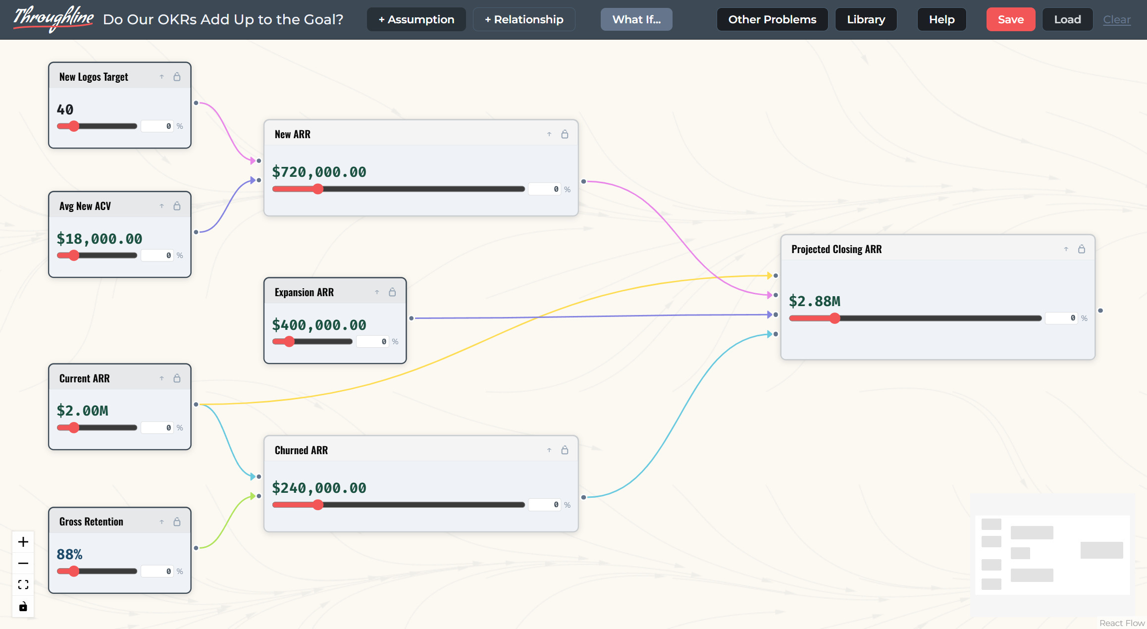
Forward is the intuitive one: drag an Assumption’s slider (say, Gross Retention up two points) and watch every downstream Relationship recompute live, with the delta shown at each node. Good for asking “what happens if.”
Backward is the one the whole tool is built around: set a target increase on an output, like “I need Projected Closing ARR up 5%,” and Throughline solves the problem in reverse. It works out what combination of upstream Assumptions would need to move to hit that target, distributing the change across whichever inputs you haven’t locked. Lock the ones you can’t influence this quarter (say, Gross Retention, because that’s a product problem) and the tool redistributes the adjustment across the ones you can.
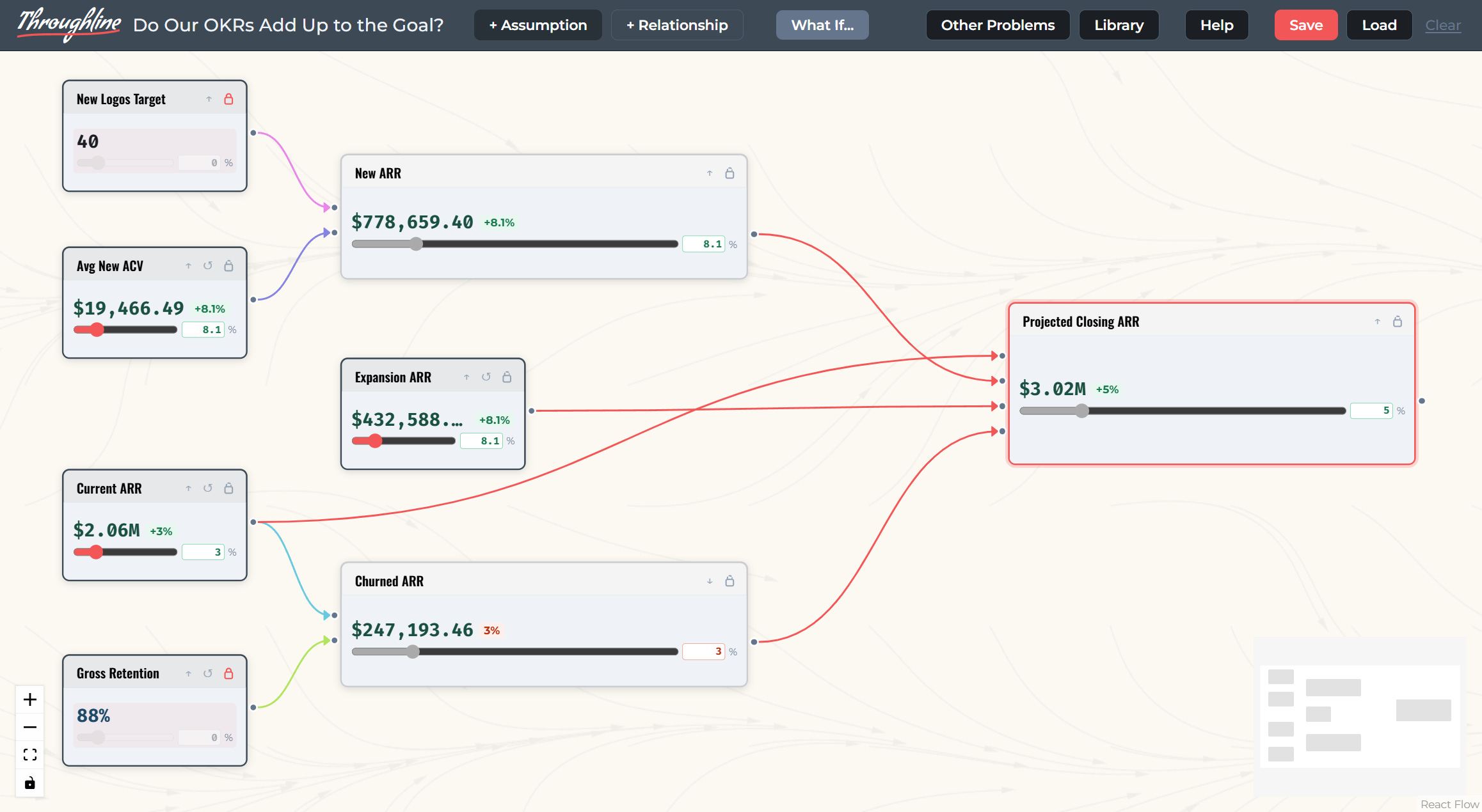
That’s the moment a lagging goal turns into a set of leading levers. Instead of “grow revenue 20%,” the team is looking at “hit 40 new logos at current ACV, or hold logos flat and lift ACV 8%.” Those are decisions someone can act on this week.
Why this matters for people used to watching lagging metrics
Most leadership reporting is built around outcomes because outcomes are what get reported up. Nobody’s dashboard leads with “assumptions about churn.” But outcomes are also the worst place to manage from, because by the time one moves, the decision that caused it is already behind you.
What changes with a model like this isn’t the reporting. It’s the conversation. Instead of a team debating whether the revenue number will hit target, they’re debating which assumption to bet on, together, with the tradeoffs sitting in front of them instead of buried in someone’s spreadsheet. That’s a debate a team can actually resolve.
Try it & Give Me Feedback
Throughline isn’t something I’m planning to market or monetize right now. It’s a tool I built because the problem bothered me, and I think it’s useful enough to put in front of other people. If you want to build a model of your own goal and see whether the backward direction surfaces something you didn’t expect, go try it. Check out the “Other Problems” section for a few different ideas of things to model with the tool.
Come back and tell me confused you, what broke, and what it got wrong. I left a lot of ideas on the cutting room floor and I’m curious where real users would want to see it go.